Authoritative Design
INTRO
A research experiment investigating the effects of visual authority and how the public reacts and interacts when it is altered outside the norm.
STEP 1: DESIGN
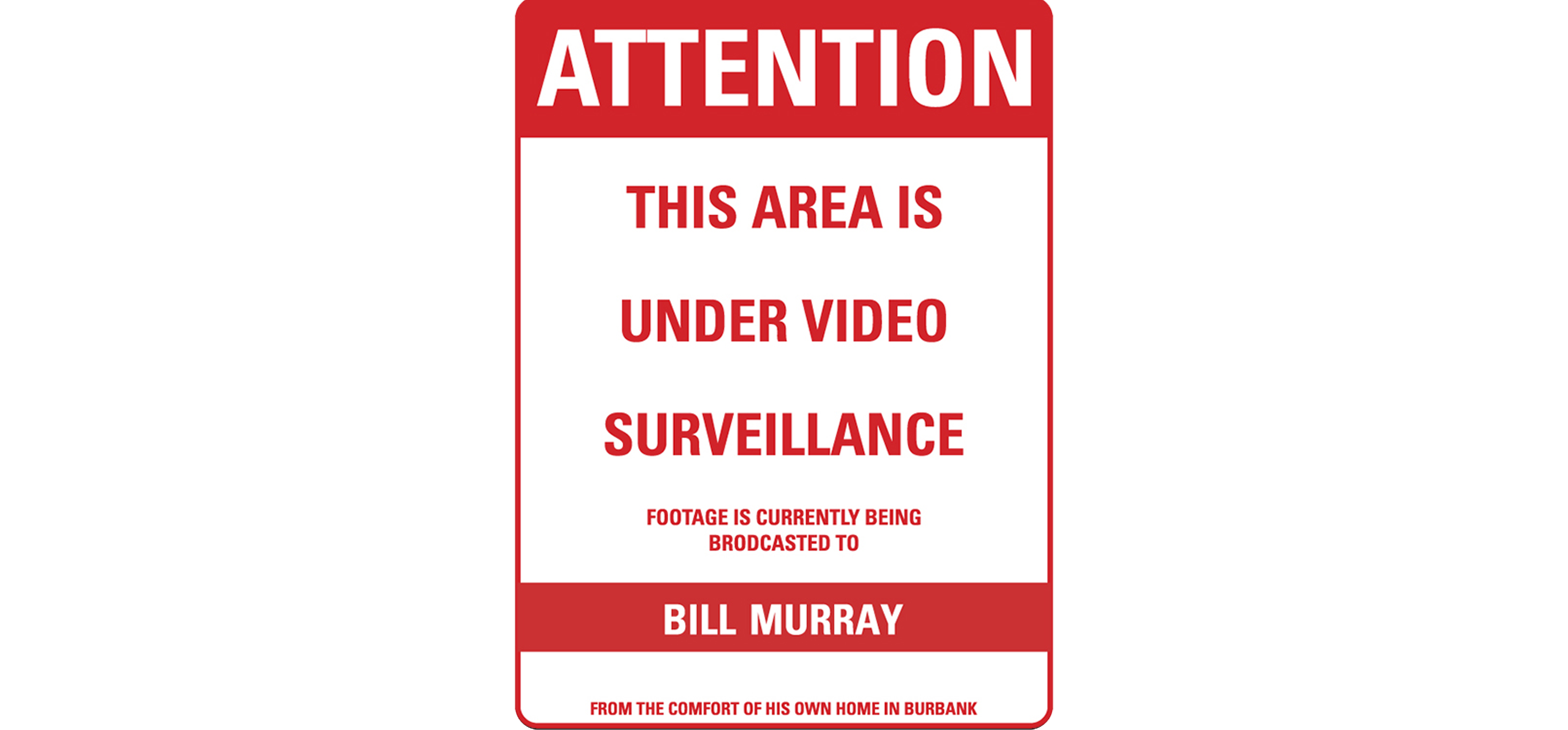
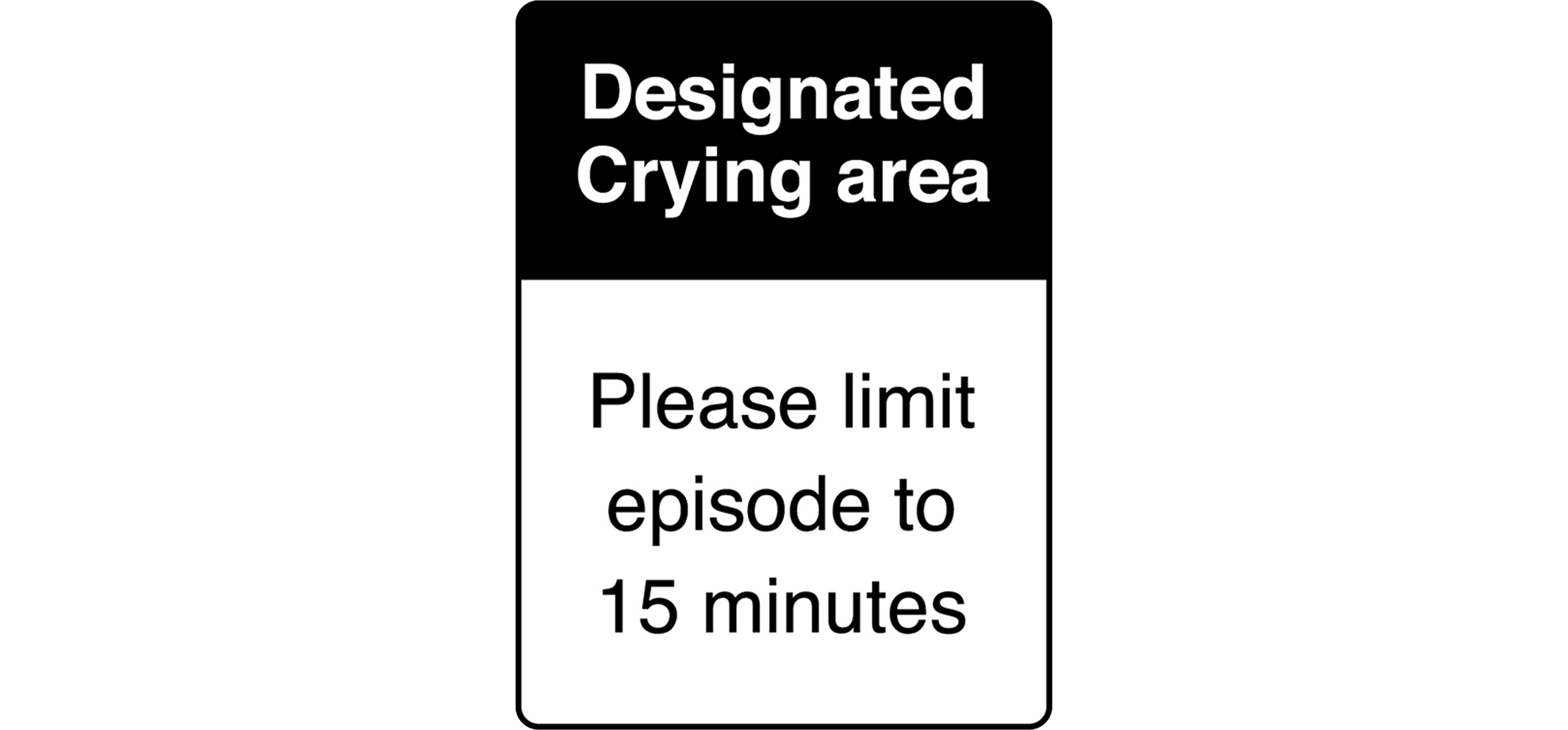
Ive chosen Street signs for this experiment By using street signs as my from of visual Authority I am about To test the public reaction I chose the visual authority of street signs because of the strict legal meaning the hold in their simple colors and graphic layout. I designed three street signs. All of them resemble the colors and layouts of a legal
STEP 2: PLACEMENT
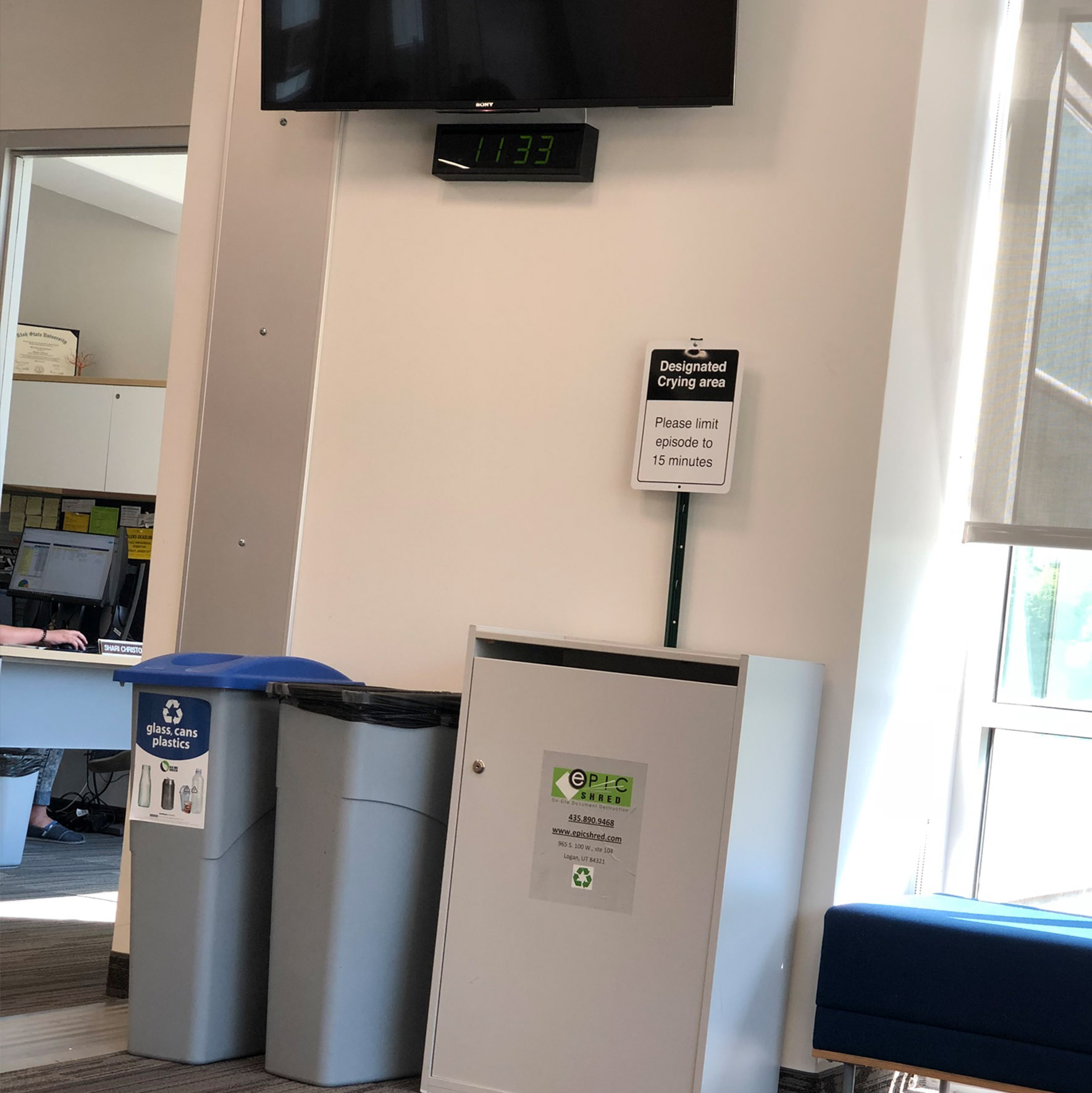
Ive chosen Street signs for this experiment By using street signs as my from of visual Authority I am about To test the public reaction I chose the visual authority of street signs because of the strict legal meaning the hold in their simple colors and graphic layout. I designed three street signs. All of them resemble the colors and layouts of a legal
CONCLUSION
CAPSTONE
AUTHORITATIVE DESIGN
One topic that has always fascinated me is the way visual design affects the social behavior of its viewer. I first became interested in these topics when I started using an psychological approach to design. By studying psychology I became interested in the subconscious viewer and how authoritative visuals have shaped the ecosystems of societies.
Two experiments; The Milgram Obedience Study and the Stanford prison experiment were two experiments in which human obedience was tested and observed. The similarities between these two studies and how they relate to design and how it relates to human obedience on a subconscious level. For example, a stop sign has a red, minimal, and straight forward design that communicates an subconscious action for the viewer. Because of this, a cohesive visual language is formed in the community and social ecosystems are created within our visual vernacular. Design proves to be a powerful tool of communications, so much so that by simply showing certain colors and shapes triggers a subconscious order in the viewers brain. This approach to design is very powerful, but also very dangerous. Humans need for self acceptance into society causes them to sometimes follow authority blindly; doing things in fear of the consequence.
With this research I would like to invoke this norm and break the illusion of city signage as a visual authority language. For my project I created three signs and posted them around the Utah State University campus. Each sign was design for a specific area of interaction. I used specific layouts and an colors to express the credentials for each specific signs.
The first signs was placed at the top of old main stairs, the layout uses black to express neutrality and the layout is plain and basic With not much variation. The sign read “ designated kissing area, please limit episode to 2 minutes”. This sign was the one that got least attention from anyone, but those who it attracted were couples out for midnight walks along old main.
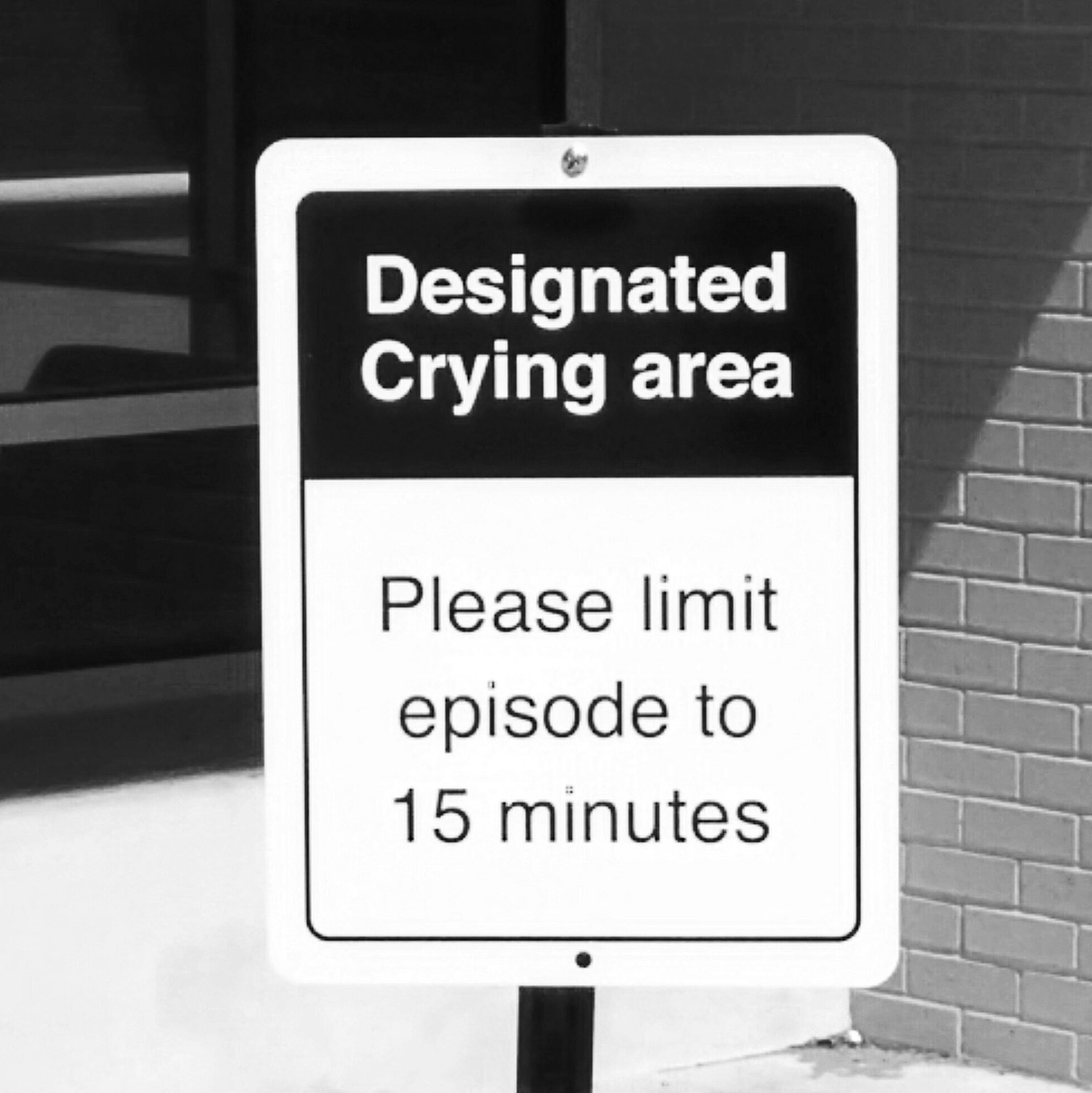
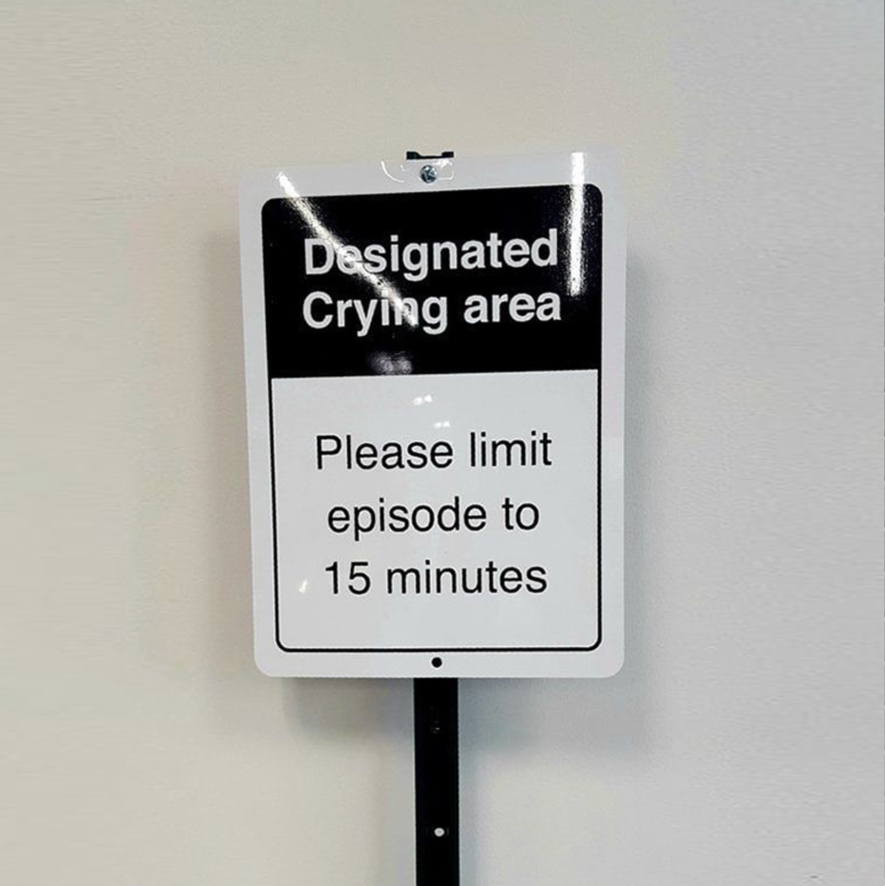
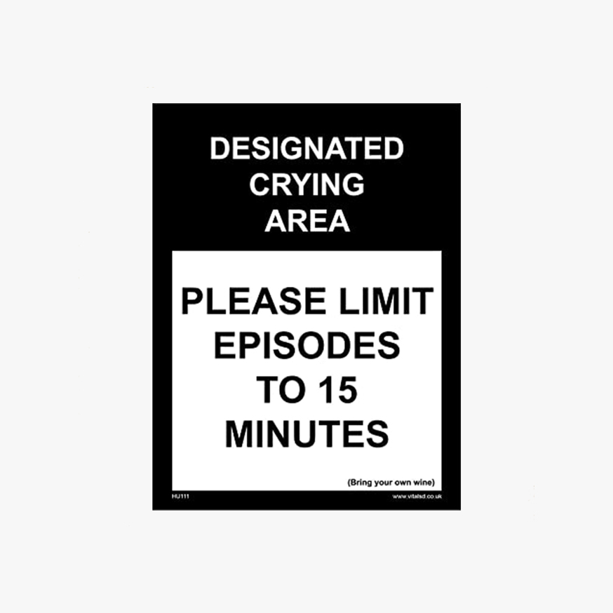
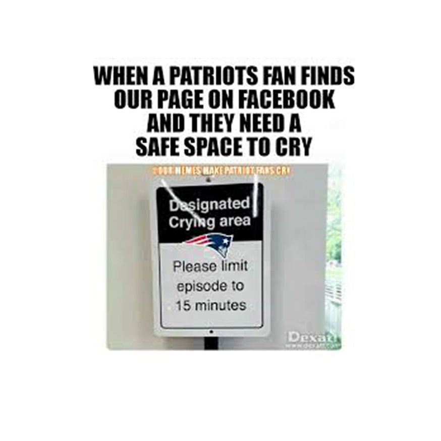
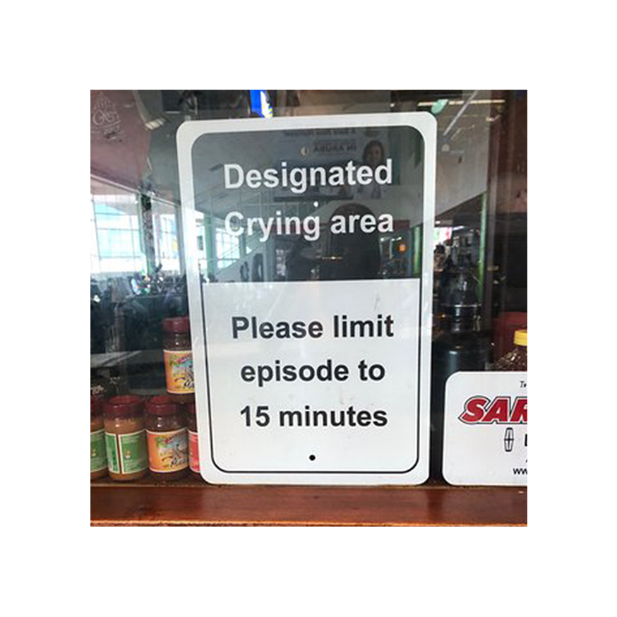
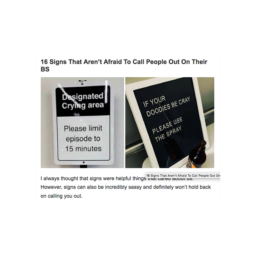
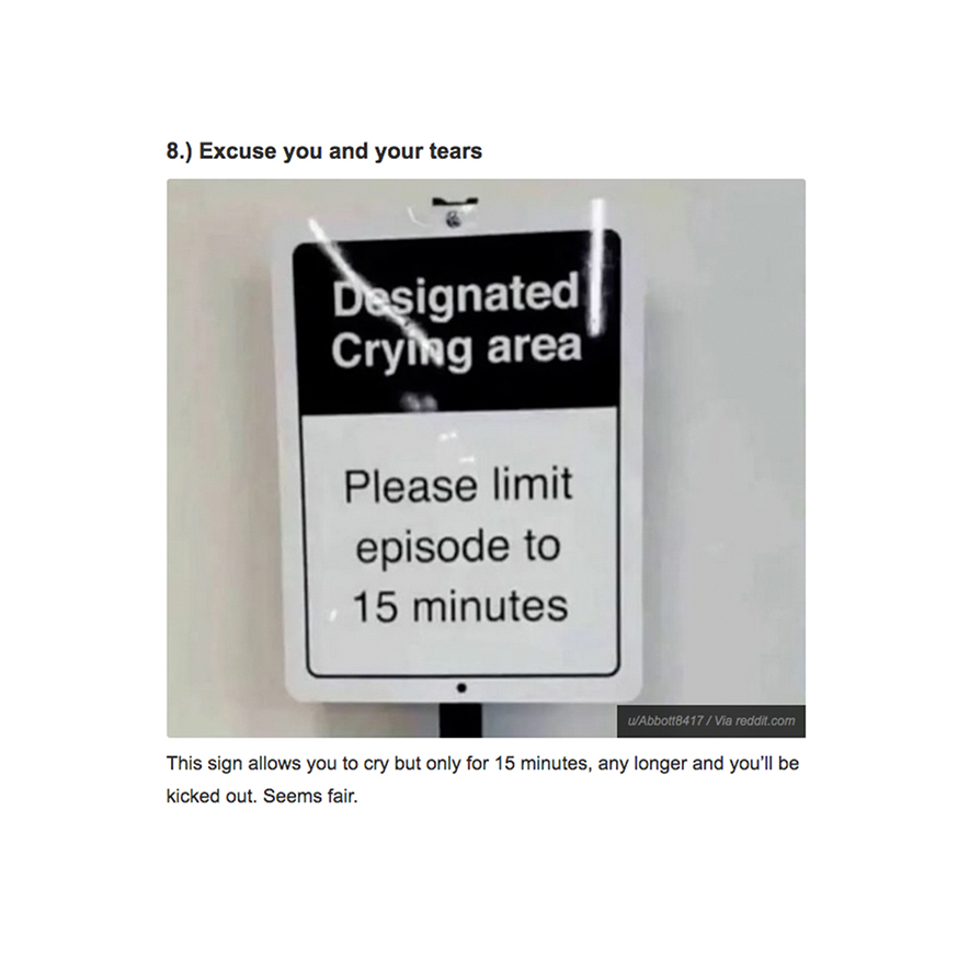
The second sign got the most attention, the “ designated crying area, please limit episode to 15 minutes” was a very popular sign. As I observed people taking photos, looking closely at it and laughing, sharing in on Facebook and social media.
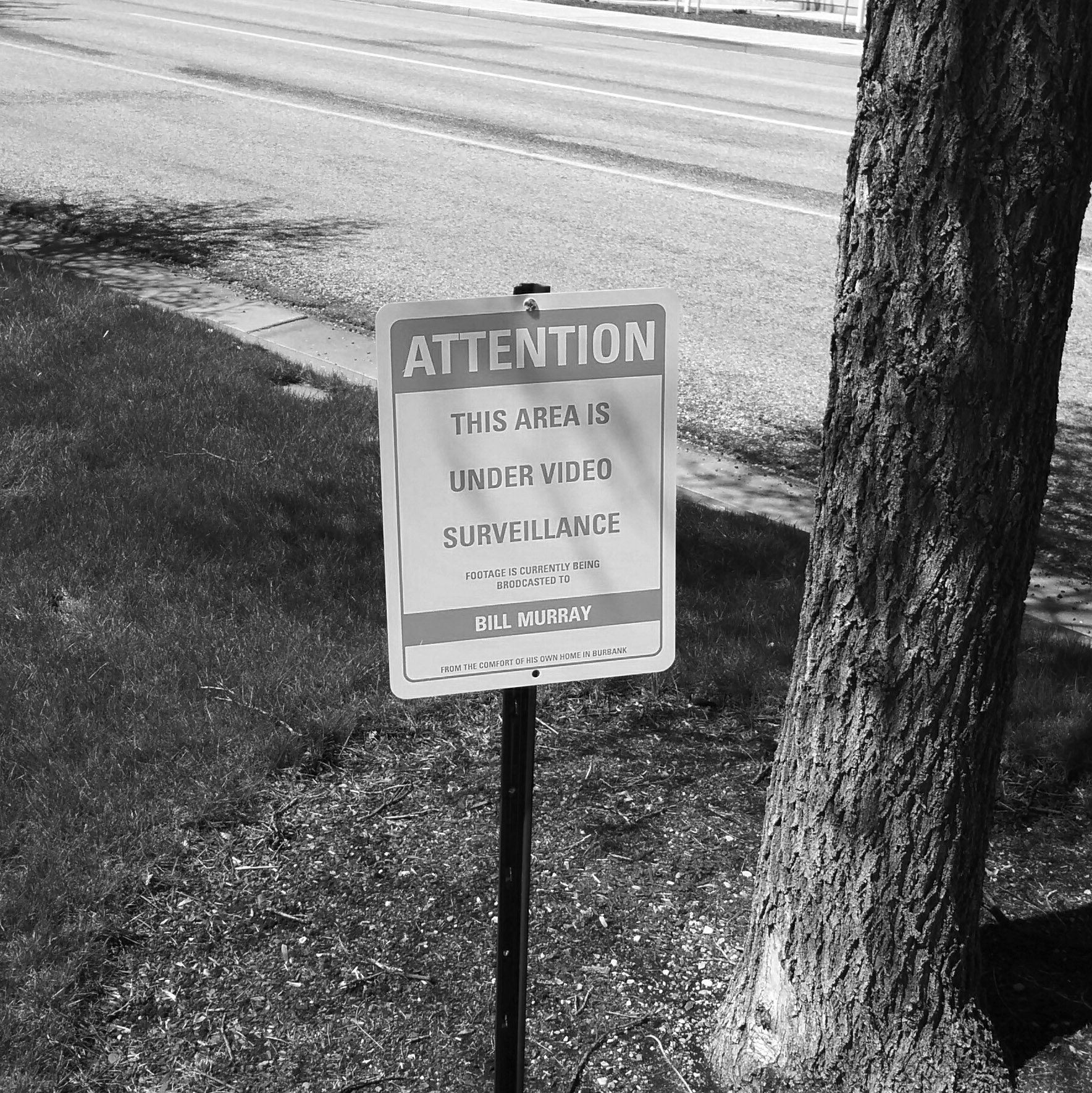
The third sign I found most interesting because of the experience I witnessed when observing it. “ ATTENTION, this area is under video surveillance, all footage is being directed to BILL MURRAY from the comfort of his own home in Burbank”. I was walking on the left side of the street looking around for a place to being my observation when suddenly a man stopped from walked and started to observe the sign. I stopped also and watched him from across the street for about two minutes. To my terror the guy started touching the sign and pushing it around, I thought he for sure was going to take it down or steal it. But instead he quickly whipped out a stick and placed it on the back of the sign then quickly walked away. I made my way over to the sign to discover that the sticker was a surveillance spoof sticker warning people against suspicious activity. I though this was interesting due to the fact that I had seen that sticker over by where I placed my first sign. I remember seeing it and being pretty paranoid about placing a sign there because of that sticker. Its interesting to think that I had previous interactions with someone else thought signs and stickers.
Overall I I thought this project was successful in a variety of areas. The first being that it invoked the social norm and made people become more aware of their surroundings and the surroundings of others. It also displayed strong evidence between the areas of social psychology and design. And lastly I think It made people more aware of signage and to question authority. This was especially prevalent when it came to focusing on the power of the situation and how that examines how we think about, influence, and relate to one another in certain conditions.
Copyright © kelseyschwanke.com

